Insanely creative and stunning packaging designs
Think about your most recent purchase.
Why did you purchase that specific brand? Was it an impulse buy, or something you genuinely needed?
Now that you’re thinking about it, odds are, you bought it because it was interesting. Yes, you may have needed shampoo, but did you need that specific brand? The one with the sleek, expensive looking bottle? No, but you bought it because you thought it would make you feel fancy, even if it’s the same product as what’s in the discount bin.
This is the purpose of packaging. Packaging, when done correctly and creatively, is ultimately what sells your product. It’s more than just putting your logo on a package. It draws attention, sends a message, and makes consumers feel a certain way.
Use Patterns
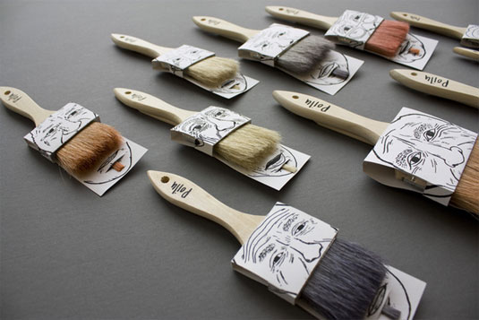
Use patterns to step up a simple take on packaging. This tool packaging is simple in structure, yet gets taken up a notch with the interesting striping on the background. The color scheme give it a quality, all-American feel, and the tools speak for themselves.
Consider All Available Space
When creating a package, utilize every inch that you can. This box uses a pretty floral pattern on the interior. Instead of leaving the inside untouched, the pattern makes the box feel more upscale, which, in turn, makes the product inside seem more upscale.
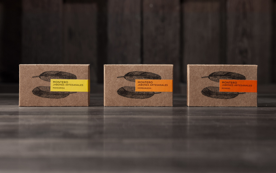
Don’t Be Afraid of Simplicity
Sometimes simplicity is key, and that holds true in this packaging. The earth toned, recycled material gives off an earthy feel, which is solidified with the feather illustration. The bright pops of color on the labels lend to the design nicely, bringing a bit more of a modern twist to the package.
Think About the Experience
Complement the Product
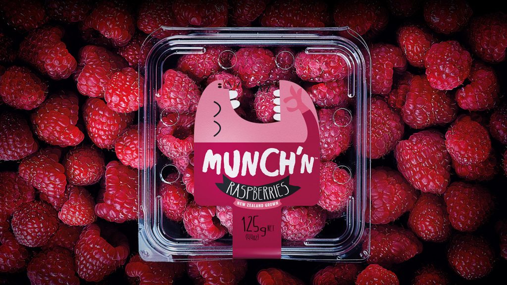
Be Playful
If you have the opportunity to be playful with your packaging, take it. This packaging is incredibly playful, yet still simple. The illustration interacts with the product but still lets it shine through. The colors relate to the berries, and the act of the character eating the berries indicates their quality.
Be Bold
Using multiple colors and shapes in an interesting pattern is a great way to stand out. This tequila packaging utilizes these things, and has a very unique look. It looks fun and playful, and promises a good time if you choose it.
Break the Mold
Consider the Process
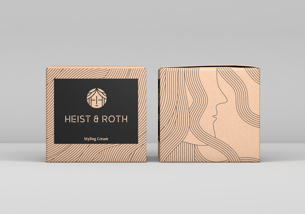
Use Stylization
Don’t feel obligated to make your illustrations or graphics completely realistic. If you can stylize your imagery and use it as a textural element, go for it. This package uses a simple illustration of a head and hair. The hair moves throughout the box, creating a pattern in the background. At first glance, you don’t know what the pattern is making, but as you explore the package, you realize it’s been hair all along.
Don’t Limit Yourself
If your product is best coming in a certain type of package, don’t limit yourself to the basic idea. This soap is best coming in a box, but instead of just a regular box you open at one end, it folds open. The folding action makes it just that much more special and interesting, and makes it something worth saving and using for decorative storage.
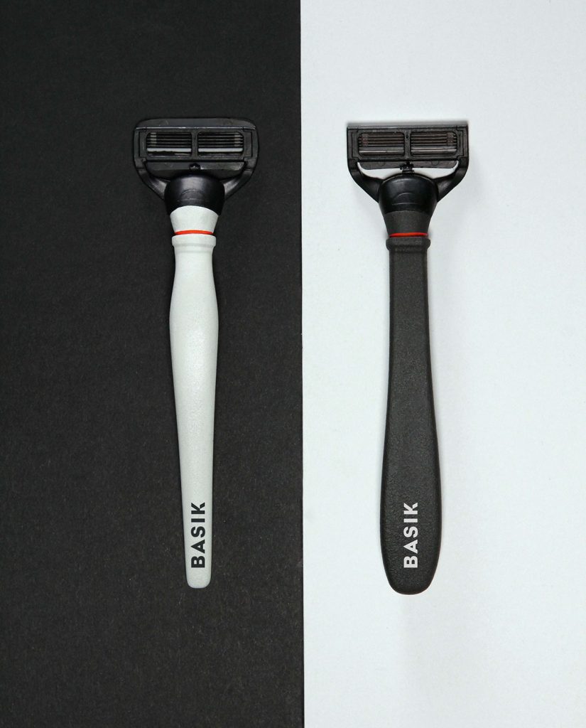
Be Modern
Modern, sleek, and simple designs stand out. Use clean lines, simple colors, and sans serif fonts to achieve a modern look. This packaging took a very modern approach, and made it even more modern by making it gender neutral. It doesn’t lean one way or the other, and draws instant attention from viewers who are curious about who the product is for.
Be Luxurious
If there’s one item people shell out tons of their hard earned cash on, it’s liquor. With so many brands out there, don’t you want to make sure yours stands out on the shelf? This liquor pulled out all the stops. It’s enclosed in a unique box, comes with shot glasses, and is an incredibly vibrant yellow and pink. It screams ‘good time’, and could be kept to display to commemorate a weekend well spent.
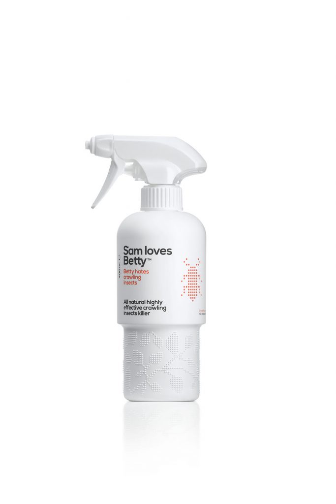
Use Texture
Instead of only using texture visually, use it physically. People will be physically interacting with your package, so appeal to their sense of touch, not just their sense of sight. This packaging for insect repellent uses texture at the bottom of their bottles. Not only does it help you keep a firm grip, but it adds an interesting sensation to your hands, and visually relates to the dotted imagery on the top area of the bottle.
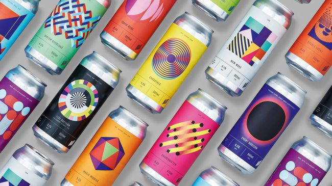
Be Bright
If your product is brightly colored, draw inspiration from it. Use accents of the bright colors in your packaging, like this candy packaging. Each candy is a different color, and each bag uses the color of the candy on its sides and in the graphics. The line as a whole feels connected, but they’re just different enough that you can get the gist when a product is different than the next (without having to look at the candy).
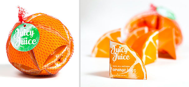
Tell a Story
If you can tell a story with your packaging, you’re doing yourself a huge favor. People love stories, and they love uncovering information they may not otherwise. This packaging for socks tells a unique story. When you pull out the socks, a tuft of cotton is stuck to the top, replicating the smoke stacks that often were found on sock mills in previous years.
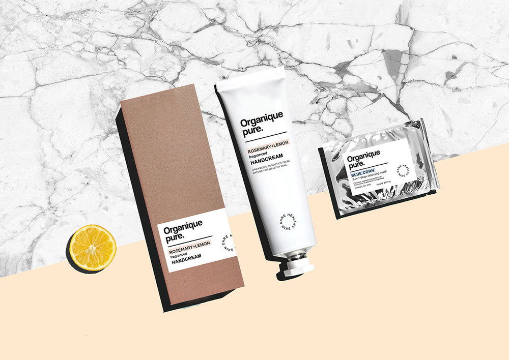
Stick to Your Roots
Analyze what your product stands for, and show that in your packaging. This beauty line stands for simple, all natural, and pure ingredients. They display that in their packaging. It is simple, clean, and looks natural. The earth toned box adds a nice flare to the natural aspect as well.
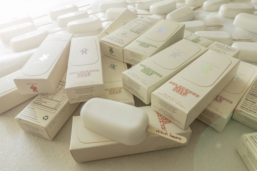
Be Creative
You can make your packaging cool, but if you can make your actual product cool, you’ve got a real winner. Take this milk soap, for example. It’s just soap made with milk, and could easily have been just another rectangular bar. But instead of doing what was expected, the soap was turned into an ice cream treat, related directly to the milk contained inside.
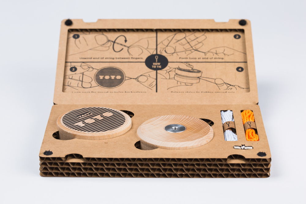
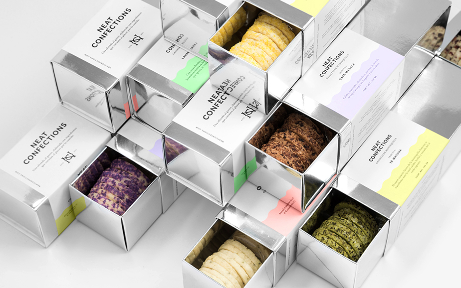
Consider the Interior
The outside of your package should be interesting, but what about the inside, where the product is actually encased? If you have multiple parts and pieces to your product, display them separately. This yoyo packaging has small cut outs for each piece of the yoyo, and they all fit neatly inside. The colors of the product relate to the colors on the box, and it pulls it together nicely.
Serve Another Purpose
Being eco-friendly is a great way to get people to love your brand. One way to be eco friendly is to give your product’s packaging another purpose. These bottles seem like normal enough cleaning products at first glance, but when you interact with them you realize they’re not made of flimsy plastic. They’re porcelain bottles, and are intended to be used as vases once the product inside is gone.
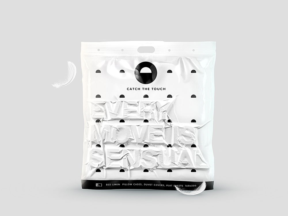
Play with the Senses
Try to appeal to every sense a human has in your packaging, if you can. The sense of touch is played up again in this sheet packaging. Small pieces were inserted inside the package before it was vacuum sealed, and it created a 3d, raised effect. It’s interesting not only to the eye, but to the hands as well.
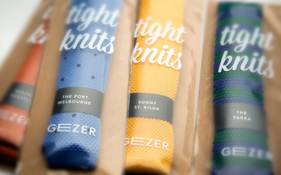
Let the Product Speak
If you have a quality product, let it speak for itself. Don’t feel the need to surround it with shiny, obnoxious wrappings if it doesn’t need it. These tights are great quality and look great as well. Instead of hiding them away in a box, they’re front and center, allowing you to see how great they really are.
Use Restricted Colors
Limit your color palette to create a cohesive look. These rice cakes drew their color palette from the flavor, sea salt and balsamic, so it took on a nautical theme.
Utilize the Product
If you can use your product as part of the actual package
Be Trendy
Piggy back off of current trends to make your packaging more current.
Think Outside the Box
Or in some cases, in it. Break the conventions of what your product is ‘supposed’ to come in.
Use Interesting Imagery
Be Literal
Make it Relatable
Include a Tactile Aspect
Be Weird
Use Humor
Don’t Be Afraid to Exaggerate
Turn it Into Something Else
Make it What it is
Incorporate Beauty
Get Ridiculous
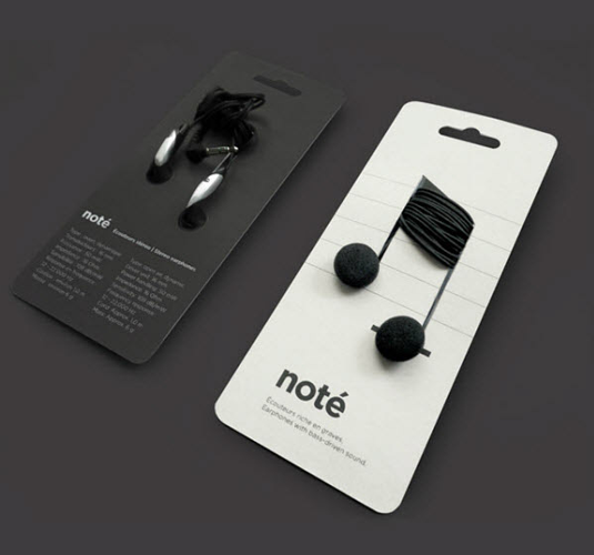
Create Something With the Product
Use the product to create your imagery, but make sure it relates to what you’re selling. These headphones are used to create music notes. Since the notes aren’t printed on the paper, they’re 3d, and really add something extra to the flat piece of cardstock.
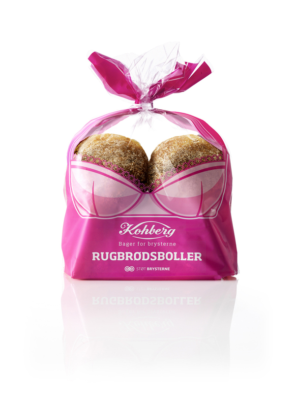
Be Risque
Being a little suggestive with your packaging can attract a different audience than you could have otherwise. This product is just regular bread, but the packaging portrays it as something else. The packaging is actually to promote breast cancer awareness, and it does a great job of attracting attention.

Be Morbid
Shock your consumers. This cigarette packaging is very shocking. It’s rooted in truth because smokers know the risks they take when they choose to light up. While it may not be the best marketing ploy, it certainly draws attention.
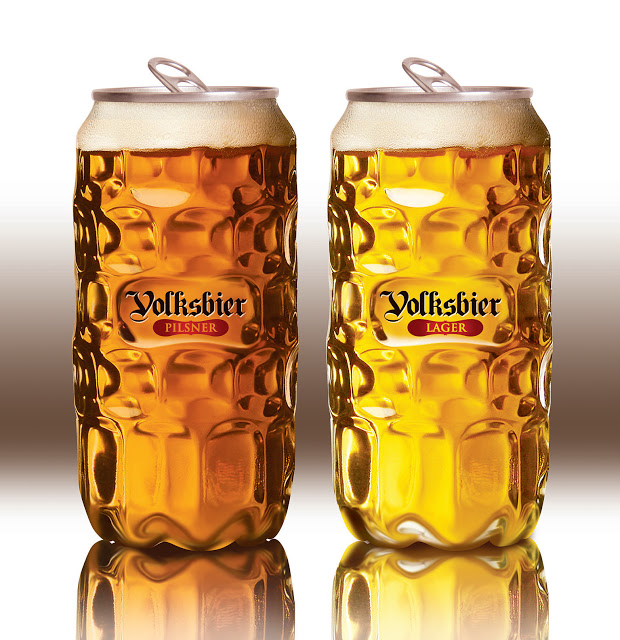
Make it Something it’s Not
Make your product look like something else – just don’t get too drastic. Canned beer is cheap, but a lot of the time, the packaging isn’t too great. This beer is canned, but appears as though it’s in a special beer glass. The contrast between the lid and the rest of the ‘can’ creates an interesting effect, and makes the beer unique.
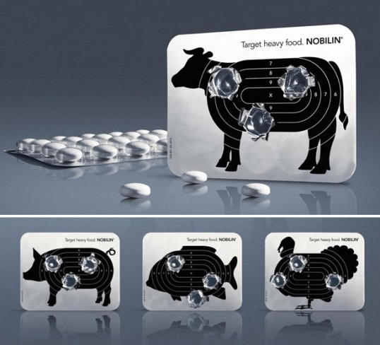
Relate it to the Cause
Relate the imagery to your cause. This packaging is for a plant based digestive aid. It takes a stab at meats, and when the pills are popped out, it looks as though they’ve been shot in a shooting range. It goes with the slogan ‘target heavy food’, and gives the impression that it’s powerful.
Use the Product to Your Advantage
Be Compact
Go Over the Top
Abstract It