How to design a logo in 5 steps:
1 Understand why you need a logo
Business really is like dating—you’re trying to attract the right customers and make them fall head over heels in love with your brand. So think of your logo as the picture on your dating profile. It’s what’s going to make people take interest and try to learn more about you (or swipe right because you’re not for them). So you want to look your best, right?
Your logo will have a huge impact on the first impression your business is going to make: It will give your customers information about your brand and let them know if it’s right for them.
A logo is important because it
Reveals your identity
Invites new customers to get to know you
Distinguishes you from the competition
Facilitates brand loyalty
Can be everywhere
Because your logo is such an essential part of your brand, you want to make sure it’s done well. All your branding materials will have your logo on them. It’ll stare back at your customers from your website, your packaging, and your business cards. Make it count! A great, professional logo design not only has the power to communicate what you stand for. It will also make a good first impression and help you stand out from the competition.
2 Plan before you start designing your logo
Define your brand personality
You want your logo to communicate your brand’s personality. And in order to do that, you first need to understand what your brand’s core personality is. Once you have a clear idea of what makes you unique and what your brand is all about, it will be much easier for you to make design choices that complement and complete that picture.
Why did we start this business?
What are beliefs and values that are important to us as a company?
What do we do better than anyone else?
What makes us special?
If we could describe our brand in three words, what would they be?
What are the three words we would want our customers to use to describe us?
Find inspiration
The hardest part of the design process can be the search for inspiration. Luckily we’ve got some tips for you that will make it really easy.
Start with a brainstorm
1. Follow the rules of the brainstorm: Brainstorming is about getting all ideas out (even those really really bad ones) and writing them down. Even a horrible idea can spark a conversation that leads to a genius solution.
2. Think like your audience: Make a list of words that describe your brand and how you want it to be perceived. Think like a person in your target demographic and always remember what would be important to them.
3. Get everyone involved: A one-person-brainstorm is fine, but only diversity will make the magic happen. Bring in people from every department or even friends and business partners. The more perspectives, the better.
When it comes to brainstorming your logo, don’t be afraid of thinking out of the box and being a bit different. See how logos like the ones for Crypto Caveman and Sweet Trip cleverly combine ideas that you wouldn’t necessarily associate with each other—like cryptocurrencies and cavemen or a honey bee and a pin on a map? These original logo choices help them express character and stand out from the crowd.
Make a mood board
Simply collect all the images you feel drawn to—those can be other logos, color combinations, illustrations or graphics, go wild! You’ll see, your mood board will reflect what style and design features you are gravitating towards in no time.
Think about how your business can be visualised in your logo. Simply Rooted is all about local, down-to-earth food and their vintage logo perfectly reflects that with hand drawn root vegetables. If you’re striving for a similar aesthetic, your mood board might include images of vintage logos, handmade illustrations and organic shapes and colors. Or take a look how the Rugged logo visualises their “rugged” brand identity in a bold and rough looking word mark but still includes a luxurious vibe with a reflective gold effect. Your mood board gives you the opportunity to pull all these elements together.
Check out the competition
The best place to steal borrow ideas? Your competition! Check out what’s already out there, what works well with your audience and what you should avoid. While stalking those other businesses, think about what makes them different from you and how you can emphasise these differences in your logo design.
Be sure to clearly set yourself apart from your competition. If all the other businesses in your industry are going monochrome, maybe you should opt for some color to stand out. If everyone else is traditional, maybe a fun and modern logo will attract attention.
Check out the three accountant logos above and how they communicate their brand personalities. The lion logo for Orthrus Ventures is classic and reliable, while the Tidy Finance logo seems modern and cool. However, if fun and approachable is what you’re going for, let Hot Toast inspire you with its bright color and whimsical illustration.
3. How to design your logo
Now that you have a clear idea of your brand and are feeling inspired, it’s time to start translating that into design. There are lots of different elements that come into play here, from colors, shapes and graphics to typography. Isolating each component and what it can do for your logo will help you take things step by step, rather than getting overwhelmed with the whole design all at once.
Choose your design style
When thinking about your logo, the first thing you want to do is pick the right design aesthetic for your brand. There is no one style that is right for everyone, only what’s best for your brand.
Classic
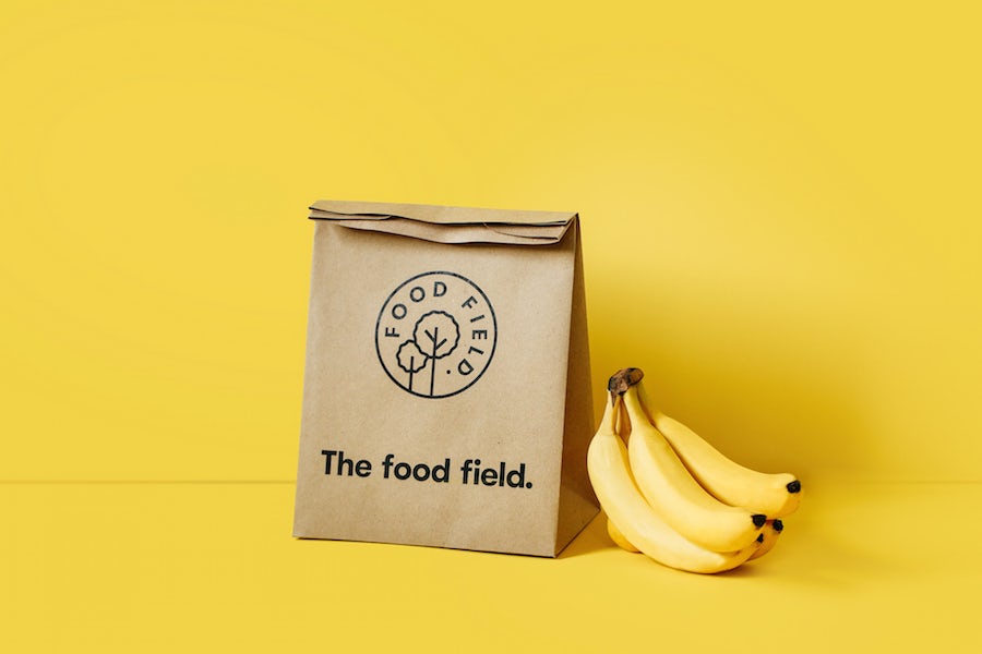
Trendy logos can be fun and exciting, but they can quickly look outdated. A classic style gives you better staying power and can help you reach a broader audience. This aesthetic keeps it simple and doesn’t venture out into crazy color palettes, graphics or fonts. A classic style tells people that you are reliable and down to earth.
Retro or vintage
There is a reason why vintage and retro design have been on trend for quite some time now. They instantly remind you of the past and evoke romantic feelings of nostalgia. A vintage logo tells customers that history is important to you and that whatever you sell is done right. Worn and hand-illustrated logos in brown and beige color palettes fit this aesthetic beautifully.
Modern and minimalist
Brands often choose a clean and minimalist style to communicate how fresh and modern they are. This style uses a lot of whitespace, minimal details and simple lines often resulting in sleek, pared back logos. A minimalist and modern style shows your customers that your brand is up-to-date, cool and knows what counts.
Fun and quirky
This is a popular choice for brands with a young (or young at heart) target customer. Fun and quirky style tends to be colorful and cute and often uses symbols or illustrations to create a positive and friendly vibe. Go for a whimsical mascot or a sweet illustration to let your brand’s fun character shine through.
Handmade and handcrafted
Handcrafted style transports a clear message: this brand is individualistic and stands for handmade quality. The style works well in combination with other aesthetics, like vintage, to really drive the message home. But it can be combined with minimal and fun styles as well for a simple and sophisticated or a bright and youthful look.
Can’t pick just one?
Of course these styles aren’t mutually exclusive: Just mix and match them to suit your brand. For instance your brand can be both handmade and fun at the same time, just take a look at how the quirky, illustrated logo for The Crafting Cactus pulls it off.
Find the right type of logo
In addition to the overall style there are 7 main types of logos
you can choose from when you are creating your logo. You can pick the one that suits your company name or overall aesthetic best, or combine them to create something unique.
1 Lettermarks (or monogram logos)
Lettermark logos can be great to streamline your company logo, especially if your name is very long or hard to remember. Lots of businesses choose to go by their initials, just think of HP, CNN or H&M. These monograms can be great for minimalist logos, but remember that they are not very good at expressing what your business is about.
2 Wordmarks (or logotypes)
Wordmarks are a very straightforward way of using you company name as a logo. To give them personality and recognition value, they are all about typography—just look at the wordmark logo for ONE. If you’ve got a great name for your brand, this could be the perfect way to put it in the foreground.
3 Pictorial marks (or logo symbols)
Pictorial marks or logo symbols are what we think of when we hear the word “logo”. They are iconographic images that are easily recognizable and represent your brand with an image. You can choose something simplistic or more complex, but make sure to pick a symbol that creates a unique connection to your brand. Oftentimes these are paired with a wordmark (ya know, so customers know your name… at least until you’re on par with Apple and Target in terms of brand recognition).
4 Abstract logo marks
Instead of a recognizable symbol, abstract logo marks are geometric forms that don’t establish an immediate connection to an existing image but create something entirely new for your brand. An abstract logo mark will condense your business into a symbol that is truly unique to you. The logo for Printy shows how modern an abstract symbol can look, while having lots of personality at the same time. If you want your abstract logo to create a certain mood or feeling, find out the meanings of different geometric logo shapes.
5 Mascots
Mascots are a fun way of giving your brand a personality. They are often colorful, cartoonish characters that represent your business in a family-friendly and approachable way, like the cheerful Gadget Mole above.
6 Combination mark
A combination mark does exactly what it says on the tin: it combines a symbol with a word mark to create an easily recognizable logo. The brand name is either placed next to the symbol, or is integrated in the graphic element, like designer ludibes demonstrates with the Brite Side logo. People will associate both elements with your brand, which allows you to use them both alone or together.
7 Emblem
Similar to combination marks, emblems are also often a combination of word and pictorial elements. They usually consist of text integrated in a symbol or icon, such as badges, seals or crests. The Rockwell Lighthouse emblem shows, how these traditional shapes can give you a very old-school and classic appearance.
Pay attention to color
Colors can have a ton of different meanings. The psychology behind color is complex, but to keep it short, colors have certain emotions and ideas attached to them. To learn more about color theory be sure to check out this in-depth guide on logo color psychology.
Red: Red stands for excitement, passion and anger. It’s a great choice if your brand is loud, youthful and wants to stand out.
Orange: Orange is much less used than red but it’s just as energetic. This is a vibrant, invigorating and playful color.
Yellow: If you want to look accessible and friendly, yellow is the right choice. It gives off a cheerful, affordable and youthful energy.
Green: Green is extremely versatile and can work for any brand really. It’s especially perfect for anyone who wants to establish a connection to nature.
Blue: Blue is a very classic and common choice. It is calming and cool and symbolizes trustworthiness and maturity.
Purple: Purple can be your ticket to looking luxurious. Depending on the shade, purple can be mysterious, eclectic or feminine.
Pink: If you’re going for girly, nothing works better than pink. But that’s not all! With shades like pastel rose, millennial pink or neon magenta, pink can give your logo a grown up and cool, but still youthful and feminine look.
Brown: Brown may sound like a strange color choice at first, but it works perfectly for rugged and masculine vintage logos. It can give your brand a handmade, unique and aged look.
Black: If you are looking for a sleek, modern and luxurious look, black will be a great choice. A minimalist black and white logo is the way to go if you want to keep it simple.
White: You want your logo to look clean, modern and minimalistic? Use lots of white in your logo. As a neutral color it works in combination with all other colors, but adds a clean, youthful and economical touch.
Gray: Gray is the ultimate color if you want to achieve a mature, classic and serious look. Darker shades look more mysterious, while lighter shades are more accessible.
Combining colors To choose colors that work well together
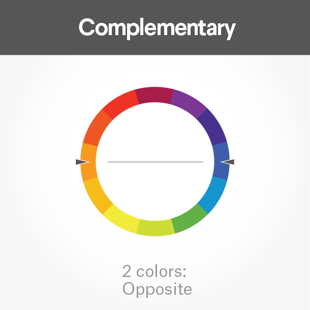
Complementary colors lie directly across from each other on the color wheel. They bring out the best in both colors and create a very dynamic look.
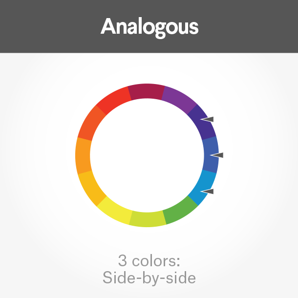
Analogous colors fall close to each other on the wheel. If you want your logo colors to be harmonious, these will work well together.
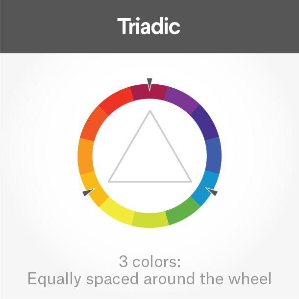
Triadic colors draw from three equal sections on the color wheel. Pick these for a stimulating and bold effect.
Pick the right typography
You want to pick a font that complements and completes your logo. There are 4 basic types of fonts you can work with to give your logo a unique look:
Serif fonts
They are very versatile and look great with any kind of design, but work especially well with vintage, elegant or classic designs.
Sans serif fonts
Sans-serif fonts are perfect for a modern and clean look. They don’t have the little feet that serif fonts have which makes them look very sleek and simple. This works great for modern brands
Script fonts
Script fonts are reminiscent of handwriting. From elegant calligraphic fonts to relaxed and down-to-earth scripts, there is a huge variety out there. Use them to make your logo look more individualistic
Display fonts
Display fonts are decorative fonts that are highly stylized and really catch the eye. Take a look at the Perfect You logo above that uses a display font to give the design a fun 70s flair.
Your typography can become really powerful when you combine different fonts with each other.
Bring your design elements together
Now that you have an idea of all the different elements your logo consists of, you need to make sure that they work together. You want to pair them in a way that is harmonious to create the vibe you are looking for.
4. Navigating the logo design process
Now that you have considered all of the necessary style points, you’re ready to start designing! There are many ways to get a logo, so you should consider which one suits you best. Agency, logo contest, 1-to-1 project or logo maker? Different prices come with different qualities and all options have their pros and cons. To get a good overview of your options
Communicate with your designer
What is a logo design brief?
A logo design brief is a document that provides a designer all of the information needed to create a logo for you. It commonly outlines fundamental information about the business, the desired design style, the project timing and the budget. Any miscommunication on these points could lead to a disconnect between you and the designer
1. Provide information about your business
Describe your product, target audience and industry
Describe your brand values
Provide your company name
Provide your company slogan (if needed)
2. Communicate your desired logo style
Express what logo type you need
Design style
Colors
Inspiration (e.g. mood board)
What is a mood board and why do I need one?
A mood board is like a collage containing a variety of images, text, and other objects that define your brand and communicate your brand identity. It can even work as a guide in developing a business project, such as a website. Whether you’re just launching your business or rethinking your existing brand, a mood board is a valuable tool, for:
Inspiration. If you’re still in the process of working out your brand identity, a mood board will help bring things into focus, like company attributes, vision, identity, and the emotions you want your brand to convey.
Affirmation. If you’re already sure of who you are, a mood board will affirm and support your brand identity. It will also help you translate concepts like culture and values into tangible things, like design.
Guidance. A mood board that accurately reflects your brand can act as a guide to keep you focused on your brand identity when creating your logo, business cards, website, or other marketing materials.
Communication. A mood board ensures that your designer, company principals and stakeholders understands your brand and your vision right from the start.
Digital or physical?
The process of creating your mood board doesn’t have to be complicated. Whether you choose to pull images from the Internet and assemble them online, or grab some foam board, Elmer’s glue, and a stack of magazines is completely up to you.
Digital mood board
Performing an online image search and compiling a digital mood board is easier than ever with the availability of some pretty cool online sites:
Pinterest: Pinterest is a popular online service that allows you to pull images from “pinboards” that have been curated by others. What’s great about Pinterest is that the collections are already organized for you, making it easier to find and choose images you like.
Moodstream: Brought to you from your friends at Getty Images, Moodstream allows you to adjust settings for image search with idea-generation and mood board assisting tools. Detailed filters–like orientation, location, image style—allow you to narrow down choices and cut down on time spent weeding out imagery you’re not interested in.
Moodboard and Mooboard Lite: Moodboard helps you organize, create and share multi-user collaborative mood boards on your iPad for just $9.99. Handy tools enable photo editing, pdf and png export and the ability to organize multiple boards. Moodboard Lite is the free version, offering all the same convenient tools as the paid version, but limited to just one board.
Sampleboard: This digital mood board creation tool lets you upload your images and organize them into project files that can be shared on social media or imported into documents. Intuitive and easy to use, it’s a great way to get professional results that can be easily shared with others.
Physical mood board
If you prefer to do things old school, you can create a physical mood board that you can actually touch. To create one, use a foam board base and spray mount images and materials to the surface. Source your collections from magazines, newspapers, old books, your own photos, or materials from a craft/art supply store, fabric store or surplus store, like Axman.
Choose your images and materials
Find a balance
Too much imagery can be confusing and overload the senses, while too little won’t provide adequate direction or information. The key to finding a balance is to start with more items, then weed out those items that don’t match up with your criteria.
Aim for your target
Who is your target demographic? Millennials or seniors? Married couples or singles? Urban, suburban, or rural residents? Male or female? Let’s say you’re business offers holistic therapy and your target demographic is women in their 40s and 50s. With them in mind, ask yourself what kind of imagery they might find appealing? What might capture their interest or grab their attention? Collect those images.
Get the picture
Look for images and materials that convey brand emotions and communicate brand identity, i.e., bravery, strength, leadership, energy, serenity, playfulness or seriousness, simplicity or sophistication, feistiness or calm. Sort through what you’ve collected and start narrowing down your choices. Going back to the therapy example—maybe one of the images you thought your target market might find appealing is flowers. While the picture might interest your audience, does it define your brand? Or could your brand be more characteristic of a healing garden with a water fountain instead?
Be consistent
Stay focused on your message. Don’t include images or words just because you like them. Every time you add something to your mood board, ask yourself, “Does this communicate my brand?” and “Is this something that my target market would find appealing?”
What to include
Really get creative and take your mood board to a whole new level with these ideas:
Imagery
Consider classic photos, vintage illustrations, or trendy images. Or go one step beyond the Internet or Good Housekeeping magazine and use your own photos. (Pinterest recently introduced a new visual search tool called Lens. “Lens is a tool inside the Pinterest mobile app that functions as a kind of Shazam for objects. Point it at food, furniture, or even the night sky, and Pinterest will return objects that it believes are related.”
Colors
What colors define your brand? Think beyond the color of your packaging to colors that convey the same emotions as your brand. Is patriotism a sentiment that your brand evokes, as is reflected in the mood board with iconic British imagery? (You can almost hear “God Save the Queen” when you look at it, can’t you?) Or does your brand suggest brightness and happiness as in the eye-popping yellow mood board? Should your colors be warm or cool? Muted or bold?
Visual metaphors
Take a step away from being literal into being figurative with images that work as visual metaphors. For example, a fast car for “speedy,” a tiger that is synonymous with “fierceness,” a lock that communicates “security,” or sparkling water to demonstrate “refreshing”
Art
Infuse your mood board with famous artwork or the styles of popular artists such as Lichtenstein, Warhol, and Van Gogh for a classic or contemporary feel.
Words
Single words or inspirational quotes combined with supporting images can be very effective in describing your brand.
Letters
Different fonts and type styles send a message too. For example, a serif font looks very professional and business-like, while a lower-case script font seems more relaxed and informal.
Texture
Photos of textures on a digital mood board or the actual materials on a physical mood board inspire thought-provoking messaging. Look for fabric, paper with texture, tiles, buttons, shells, or flowers.
Patterns and shapes
Organic shapes found in nature reflect tranquility and calm, while repeating patterns create visual energy and movement.
Pulling it all together
Now that you’ve collected and sorted your materials and images, position them on your mood board. Concentrate on key themes with larger images, and place smaller images or materials around those to support your message.
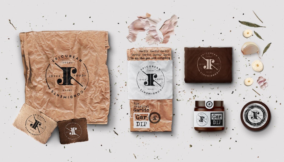
Producing a mood board for your new business is an ideal first step to help you identify and develop your brand. It will prove useful as a guide when you begin creating your company’s marketing, taking it from mood board to something as impactful and memorable as this brand identity package.
3. Clarify timing and budget
Timing
The design process is just that: a process. While creating a great logo design can happen unexpectedly in a few hours, it often requires a period of experimentation and exploration on the part of the designer. For this reason, allowing more time to designers will increase your chances of receiving amazing designs.
Budget
It can be awkward to talk about money, but it’s necessary if you have a budget and need to stick to it! Make sure you clarify if the designer works on a per-project or hourly basis. If they’re per-project, clarify how many versions and revisions of the logo you’ll get. If they work hourly, ask them approximately how long they think your project will take.
Evaluate your options
This step can be the hardest, so get some feedback from friends, potential customers and colleagues to help you make a decision. Here are some general questions to ask yourself when evaluating your logo options:
- Can you tell what it is in 2 seconds? Will people immediately know what your business does?
- Is it simple and memorable? Will your customers be able to remember it?
- Is it versatile? Can it be applied to all your brand’s needs?
- Is it timeless, or would you have to do a redesign in a couple of years?
- Is it unique? Does it set you apart from your competitors?
- Does it appeal to your target audience?
Obviously your brand’s needs and expectations for a logo will be much different if you sell children’s clothing and need a simple logo that can be stitched onto fabric than if you make sophisticated high-end wine with an intricate label, or a high-tech app that lives on peoples’ phones. So don’t forget to take a step back and consider the bigger picture. This is not about personal taste, it’s about what works best for your brand.
What not to do when designing a logo
There are some common pitfalls that await you when you’re designing your logo. Here are some tips on what not to do:
- Don’t give in to the clichés of your industry. You’re a dentist so your logo needs to have a tooth in it? Definitely not. Here’s how to avoid generic logos.
- Don’t make it too complicated. Simplicity is key for a memorable (and printable) logo.
- Don’t try to be too trendy. Trends are fantastic, but make sure your logo won’t look dated in three years.
- Don’t go with an amateur. Your friend/intern/cousin has used Photoshop before, so they can save you some money and design your logo? Just don’t.
Once you have your logo, you’ve created the ideal basis for all the branding material your business needs—whether it’s business cards, packaging design or web design. By setting the tone for your style, color palette, font and overall look and feel your logo is the starting point for your brand collateral and your designer will be able to create a seamless look for you. And just like that, your business is ready to show the world its brand new face!
How much should your logo design cost?
logo is an essential part of any brand’s identity—it’s often the first thing a potential customer will see, and it’s critical to use a logo that stands out from the competition. As with all business spending, you want to weigh the cost of logo design against the quality and value you will gain.
Hiring a professional designer or design firm helps ensure that your final logo design will be distinctive and communicate your brand’s message. Like with any service, logo design has a range of price points and packages, and it’s important to understand what you’re getting—or not getting—for your money.
Take a look at your budget and let us help you decide the best way to spend based on your needs.
So, how much does logo design cost?
The cost of a logo design is anywhere from $0 to tens of thousands of dollars, but if you’re a small business or startup looking for quality design, a good logo design should cost between $300-$1300.
| …………………………………………….. | $10-$50 | $250-$800 | $800-$2,500 | $2,500+ |
| Logo design options | Logo maker | Freelance designer or design contest | Freelance designer or design contest | Design agency |
| Quality | Basic and generic logos built with a selection of stock icons and fonts. Very quick turnaround time. | Designers with promise but limited experience or a smaller portfolio. | Experienced designers and professional service and advice. | Guaranteed high-quality designs from a full-service team of creative strategists. |
| Who should use it | Extremely budget- & time-conscious businesses that are OK with a generic design | Businesses that have a good understanding of the design process and would rather spend time than money | Businesses that want quality on a mid-range budget | Well-resourced businesses that want a complete, top-to-bottom branding package |
Low cost: under $300
Logo Maker
The cheapest option for getting a logo is to make it yourself. If you’re a trained designer and know your way around Illustrator well, there ya go. If you’re not, that leads you to a logo generator.
While logo generators are the cheapest option ($0 to use the service and $10-$50 to purchase your design), they only offer limited, generic icon and font options. If you go this route and you have a fairly honed design aesthetic, you might get a usable (if generic) logo. If you don’t have any design training, you may end up with something that feels just a little off.
You may find freelancers who are willing to give you a logo for under $300. It may be a great deal, but like with all great deals you should ask yourself why you’re getting it… If it’s because you did a favor for the designer’s mom, then score one for you! If you found them on an anonymous website, it’s not unlikely they’re going to give you something as generic as you could have made yourself.
Midrange: $300-$2500
If you have a few hundred to a few thousand dollars in your budget, you’ve hit the sweet spot for logo design cost: you’re probably going to get a pretty good design, and won’t have to break the bank.
Within this price range, you have two options for getting a design: working with a freelancer or a logo design contest
And we know: there’s a big difference between $300 and $2000. Don’t worry, we’ve made sure to break down why and when you’ll want to pay more.
And we know: there’s a big difference between $300 and $2000. Don’t worry, we’ve made sure to break down why and when you’ll want to pay more.
Freelance designer
Using a freelance designer can be a great experience—you get an expert customizing your logo based on your feedback. However, there is a very wide range of experience, which means a broad spectrum of cost and quality of work. It’s important to vet prospective designers if you want to work one-on-one. Viewing their portfolios and testimonials is imperative, and getting a direct referral from someone you trust is even better.
When choosing a freelancer, you’ll want to consider:
- how they bill (hourly vs. per project)
- how much experience they have
Generally, you’re going to get a higher quote from someone who has a proven track record. They will also give you a detailed break down of what you get for your money (or how long they anticipate your project to take).
If you’re looking to spend $300-$800 you will likely be working with a less tested graphic designer. This can be great if you have a clear vision, experience giving feedback on design work, and time to work out the kinks. If you’re looking for more support in getting what you want, and you don’t have hours to spend going back and forth, you should probably consider spending in the $800-$2000 range.
Logo contest
Combining the stability of flat fee pricing with a wide range of design options for your logos, a logo design contest commissions multiple design ideas from a global community of designers, giving you dozens of unique ideas for your company’s logo. During the contest (which typically takes one to two weeks to complete), you have the opportunity to interact with designers and give feedback on different versions of their designs, so you can help shape the end product.
logo packages range from $299 to $1299, so a business on any budget can invest in a professionally designed logo.
Like with freelancers, you can get a good design for any price, but if you pay more it will be easier to do so. When you pay more, the prize for the winning designer is bigger, too. More experienced designers participate in your contest, so you get more high-quality designs to choose from.
When selecting your app contest package, think about how much time you’ll have and what experience you have writing briefs and working with designers. If you’re still unsure, contact us for a design consultation.
High end: $2,500+
When you buy a logo design you end up with… a logo! But if you’re willing and able to pay more, you can get more. Usually, this means working with a design agency. Which also means a price tag that’s $10,000+.
Design Agencies
A professional design or branding agency is another option for getting your logo designed, and often includes a top-to-bottom branding package for the cost. Design agencies often conduct market research and competitor analysis to figure out how your brand can stand out in a good way. Agencies employ creative teams that will approach your project from all angles, ensuring thorough work that is backed up with business data.
Of course, one of the biggest hurdles to hiring a design agency is the cost. Brand identity packages (which include a logo) start at about $10,000 with an agency, and are typically out of budget for small brands. Additionally, not all agencies are created equal. As with hiring a freelance designer, you should do your research into their work, style and client satisfaction.
What do I get for my money?
Regardless of what direction you choose for your logo design project, it’s important that you know exactly what you should be getting for your money. Whether you opt to hire a freelance designer, launch a design contest or spring for an agency, make sure that the following checklist is a part of your agreement:
- Your final logo design in multiple formats
- High-resolution, vector format for printing
- Web-optimized format for website, social media and other digital needs
- Full legal copyright
- This ensures that your logo design is exclusively yours
- Designers will release the copyright prior to final payment